Are you trying to attract fans and get noticed? Are you trying to explain your product or service to a new audience? Maybe you’d like to express your brand message.
One thing is for sure: images are an easy, affordable way to boost your marketing efforts and get fans raving about you. It’s as simple as adding some images to your social media and blog posts.
Infographics are one type of image that fans love. You can use them in your blogs and in social media. Create once, use many times. I love that about infographics!
And you don’t need to be a graphic designer or artistic to create them. You can create infographics yourself easily with a little help from templates and an outline.

Infographics are visual representations of information and data. Since 90% of information that is transmitted to the brain is visual, infographics are effective in your marketing efforts. Here are some compelling facts:
- Infographics are liked and shared on social media 3x more than any other content (which leads to 94% extra infographic views).
- People following directions with text and illustrations do 323% better than people following directions without illustrations.
- An infographic is 30 times more likely to be read than a purely textual article.
The internet is filled with expensive, complex infographics. But you don’t need to create images this complicated to benefit from visual content marketing! Infographics are effective even if they’re small, inexpensive, and simple.
We’ll discuss:
- How to create an infographic (step-by-step)
- Tools that make creating an infographic easy and fast
- How to repurpose your infographic content
How to Create Infographics (Even If You’d Rather Be at the Beach)
1) Start with an Existing Blog
Find a blog post that is well-written in a format that includes subheadings and lists.
If you want to promote your content, use your own blog.
You can also create an infographic using someone else’s blog. I’m not suggesting plagiarism! Be sure to credit the author when you publish your infographic and contact them. (Incidentally, this is one way to get noticed and possibly promoted by influencers in your industry.)
2) Create an Outline
Review the blog you’ve chosen. Create an outline using the following format:
- Title
- Summary of the topic
- Sub-headings (if applicable)
- Main points or highlights
- Brief summary of each main point
- Conclusion or Call-to-Action
- Sources (if applicable)
- Business Information
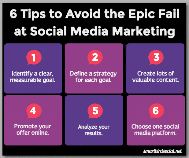
For example, I used the outline below for my infographic in 8 Tips to Avoid the Epic Fail at Social Media Marketing.
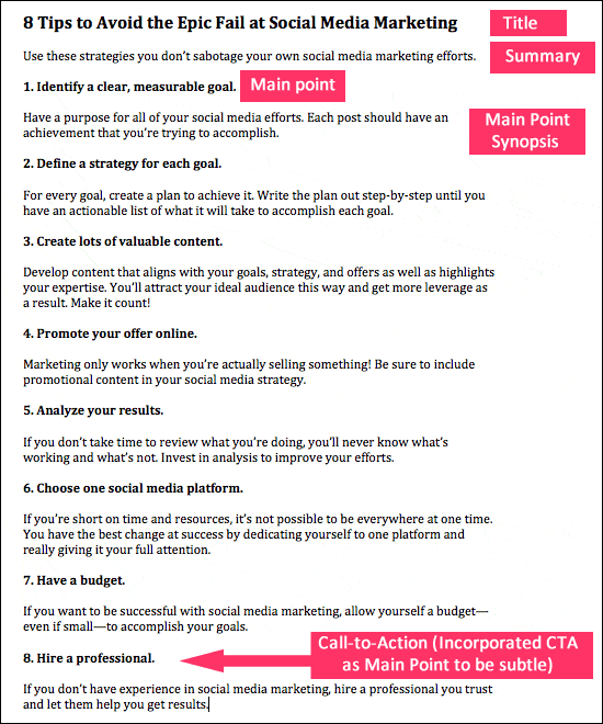
If you’re new to creating infographics, a separate outline really helps. To make your outline quickly, copy and paste the text directly from the blog into another document. If you used an outline to create your blog post initially, you can probably skip this step.
3) Define a Layout
Looking at your outline, determine what structure would best suit your infographic. According to OneSpot, there are eight types of infographics.
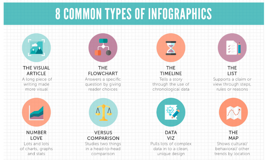
But we’re aiming for simple here. Usually, I think of four layout options. You’ll see three of them match OneSpot’s descriptions.
- The List
- The Timeline
- The Comparison
- The Sectional
The last layout is a vertical compilation of your topics in sectional format separated by topic/title. An example of the Sectional format is in this infographic about using Twitter for business.
As you can see in my textual outline, I’m using a List format. Now it’s time to find a template to use if you don’t want to design your infographic from scratch. That’s what we’re going to do.
4) Choose a Template
Nowadays there are plenty of online graphic design applications that help the non-designers look like pros. Here is my list.
Canva
If you’re already creating images, then Canva is no surprise to you. It’s number one on my list. The app is affordable (free and paid versions), offers useful tutorials, and is easy to use. No Photoshop required!
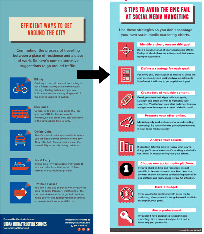
Combine those qualities with Canva’s free, easy-to-use infographic templates, and all I can think is: it can’t get much easier than this. Here is how I went from my blog > outline > template > infographic.
Venngage
This app is one of my favorites for infographic creation. Venngage has a nice selection of robust, free templates. A paid version is also available.
There are many aspects of Venngage that I appreciate:
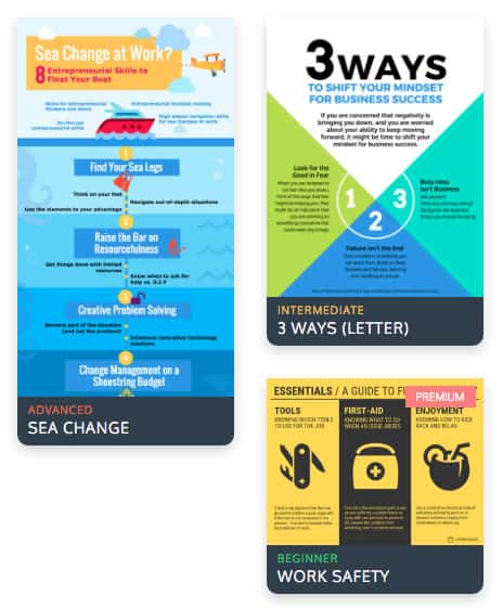
- The templates are labeled as Beginner, Intermediate, or Advanced.
- The templates are diverse, attractive, and categorized.
- The user interface offers many customized options, which make it versatile (but a little more complex).
- The drag and drop creator makes image creation simple and fast.
Venngage’s paid version removes their branding, controls privacy settings, and offers all of the pro options.
Visme
Visme is incredible! The app has a ton of features for infographics. From within the app, you have access to backgrounds, free images, uncommon fonts, an audio library, video embeds, animated text, and more. This is infographic design on steroids. (Seriously, even the options have options!)
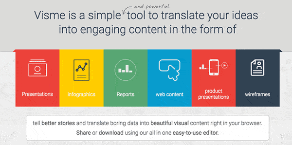
Due to the many choices in Visme, the app is more advanced and the interface is more complex. This makes it a great choice for those of you with a background or interest in design and a creative vision. The paid version has access to better options, far more templates, and a brand-free image, which makes it preferable.
(Read on to see the mini-infographic that I created using Visme.)
How to Re-purpose Your Infographic Content
I love infographics because you can re-use the visual content. Create once, use multiple times and multiple ways. Lots of bang for your buck, as they say. There are several options.
In Social Media
You can snip portions of an infographic to use in social media posts. For example, I snipped the infographic above that I created in Canva and created a Tweet:
Resist the urge to be on too many social media platforms! https://t.co/nH0om0Mt9P via @smartbirdsocial pic.twitter.com/5zfiHI9Wiv
— Meghan Monaghan (@MeghanMonaghan1) August 9, 2016
How simple was that?! Think about how many social media posts you can create with one infographic. And, if you’re creating content that is evergreen, you can recycle the posts. That is a lot of content!
In Your Blog
Using portions/snippets of an infographic in your blog works similarly. You can use someone else’s infographic like I did above with OneSpot’s image. Or you can use snippets from your own infographic in a different blog post.
Remember the infographic that Contellio created for Kim Garst (pictured above)? She clipped the infographic so that each list item had an accompanying image. Then she used the images in her post. (Side note: this is a great way to catch the eye of influencers!)
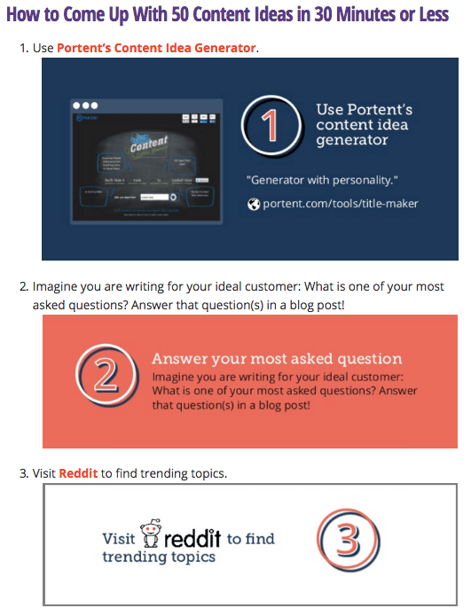
Here’s the full blog post: How to Come Up with 50 Content Ideas in 30 Minutes or Less
As a Mini Infographic
Smaller versions of infographics do well on social media. Simply create a portion-size of the larger infographic. This is similar to re-purposing. However, the intent is to create a standalone infographic versus a snippet.
I’ve taken the above infographic that I created the outline for and made it into a mini-infographic using Visme. I shortened the list for this example.
Now You Know How to Create Infographics
Were you aware that creating an infographic could be this simple? Had you considered using snippets of infographics in your own content? If you’re interested in more information about infographics, visit the Simple Slides website.
Have I convinced you to create your own infographic and repurpose it? You might as well repurpose your content to get as much use out of it as you can!

Wow, Meghan. Thanks for opening my eyes to all the possibilities. I was always kind of intimidated by the infographic format. Well, I guess I have no excuse now. Definitely, will be setting time aside to start incorporating this into how I write blogs and social media.
OMG.. I so love this.. but then again.. I do love creating graphics I just know I can get carried away with over doing it which is why I may not want to! lol
What plugin for the Twitter image with info it in? Tweet me! lol